81. The "Comparing" Radical: 比
Compared with other radicals, the "comparing" radical 比 isn't complicated!
This four-stroke shape has no variants. The English names are "comparing" or "compare," reflecting the primary meaning of this character:
比 (771: to compare, contrast; ratio; Philippines)
This is, in fact, the only Joyo kanji with an on-duty 比 radical. Again, simple!
The Japanese Names of the "Comparing" Radical
The two Joyo yomi of 比, くら•べる and ヒ, play roles in the Japanese radical names:
くらべる
ならびひ
くらべるひ
The first one matches the Joyo kun-yomi. The last name combines the two readings. As for ならびひ, that corresponds to 並び (ならび: line) + ヒ. The idea is that the 比 shape consists of two lined-up katakana ヒs.
What are we to make of the fact that 比 carries the ヒ yomi and seems to possess two such shapes? As I wrote in Crazy for Kanji in Exhibit 22, the Japanese created katakana by breaking off parts of kanji. The katakana ヒ came from the 比 kanji.
Both ならびひ and くらべるひ distinguish 比 from two other radicals that can also be called ひ:
匕 (radical 21: "katakana hi")
日 (radical 72: "sun")
As I've said in the Radical Note about 匕, there are minuscule differences between the katakana ヒ and radical 21. Most notably, the lower right part of the 匕 radical curves upward, whereas the kana ヒ sticks to the baseline. That's not really relevant to our understanding of 比, but with so many similar shapes floating into view, I wanted to differentiate them clearly.

I thought this book would caution against comparing oneself to others. Instead, the title implies that as we will inevitably measure ourselves in that way, we'd better do it right. The title features two instances of 比べる (くらべる: to compare):
「どうせ比べるなら、上手に比べなさい。」
After All, If You Compare, Do So Skillfully
どうせ (after all); 上手に (じょうずに: skillfully)
The Etymology of 比
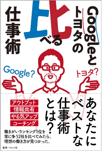
According to Henshall in his newer edition, early forms of 比 depicted “two people in line.” The character originally meant “lined up.” From there, comparisons of two similar entities gave rise to extended senses of the character. In other words, the ancient Chinese initially used 比 for comparisons of lined-up objects. From there the comparisons could become more abstract. Good thing, too. I don't think one could make Google and Toyota stand side by side in any way, though they're compared in the following book.

We again find 比べる in this title:
「Googleとトヨタの比べる仕事術」
Comparing the Work Techniques of Google and Toyota
仕事 (しごと: work);
-術 (-じゅつ: technique)
That sounds to me like apples and oranges, but I've learned that it's natural to compare these two companies. After all, both come at the top of many company rankings, and each one has innovative work techniques. Readers can compare the two and decide which approach works better for them.
